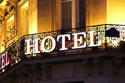
There are important elements to consider during your sign design sessions, such as the quality of your logo and the type of font you choose for your company’s name. These design elements will help you develop the perfect sign design near Chandler and Phoenix. Read on to learn more about designing your exterior illuminated sign.
Typeface
The typeface, also known as the font, is one of the most important elements to go into all of your signage. If customers cannot decipher your company’s name or slogan, then they will likely choose another establishment. Pick out 3 to 5 of your favorite fonts, and see how your company’s name and slogan look in each font. View the proposed signage at different distances to see which one looks best from all viewing points. 
Images
Your company’s image or logo should be identifiable with what you sell or the services you offer. The logo should be memorable and simple to easily transfer between different mediums. For example, a large logo on your illuminated storefront sign should be just as attractive on a smaller interior sign.
Colors
An exterior illuminated sign can feature a multitude of colors, so you do not have to limit yourself. However, consider the colors you choose and how they look together. For example, blue and purple should not be close together on your sign, because they are so close in hue that your customers may not see the logo definition. Also, consider matching the color to your industry, such as red and orange for restaurants and green and brown for grocery stores.
Information
If your company has a well-known slogan, then you may feature it on your exterior sign. Ensure that the slogan, and any extra information, is brief and legible. Your customers should be able to skim the sign in a couple seconds. If your signage is overloaded with information, then your customers will skip the information and possibly skip your store.

